 All Case Studies










Glowlush design at a glance
The main facts of the Glowlush design project.
| Item | Detail |
|---|---|
| Client and industry | Glowlush, brightening skincare |
| Market and audience | India, mobile skincare shoppers |
| Engagement period | Not documented |
| Our scope | Storefront design for desktop and mobile |
| Platform and stack | Not documented |
| Live URL | Not applicable |
Challenge
Glowlush is an Indian skincare brand whose range centres on brightening face care. Dcrayon designed its storefront, with the home page and product pages planned for phone screens first.
The range includes an instant brightening and polishing face wash made with kojic acid and alpha arbutin, and a bridal brightening cream. Both are products that shoppers tend to research before they buy. Dcrayon's design covered the desktop home page and the mobile product page, the two screens a first-time buyer is most likely to see.
Two design problems for a brightening range
A small range needed one clear message.
When a brand sells a handful of related products, a home page that simply lists them reads like a catalogue page. Glowlush needed a single headline idea that tied the range together and gave the shopper a reason to keep scrolling.
Product details had to fit on a phone without scrolling.
A product title that names two actives, a sale price with the original price beside it and a quantity choice can easily spill below the fold on a small screen. The shopper should see the product, what is in it, what it costs and how many to add, all at once.
Solution
A hero built on one line about skin
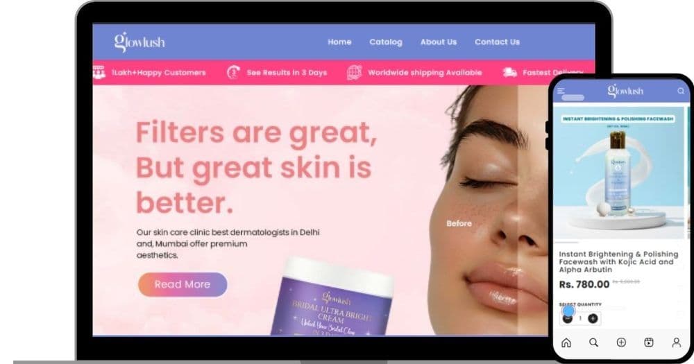
The design opens with a soft pink hero and the line "Filters are great, but great skin is better", set beside a face image split into before and after halves, with the bridal cream in the foreground and a single call-to-action button. Above it, a periwinkle header keeps navigation to four links: Home, Catalog, About Us and Contact Us. A contrasting pink strip under the header carries short service messages, so they sit near the top of the page without taking space from the products.
A product page that fits one phone screen
On the mobile product page, the product image fills the top of the screen, followed by the full product name with its actives, the sale price with the original price struck through, and a quantity stepper, so the decision fits on one screen. The periwinkle and pink palette runs through both layouts, which keeps the brand recognisable as the shopper moves from the home page to a product. This is UI/UX design work, carried into an e-commerce storefront layout.
Glowlush design parts by page
The design elements in the Glowlush mock-up, from small details to whole screens.
| Component level | Examples from this build | Used on |
|---|---|---|
| Brand palette | Periwinkle header, pink hero and service strip | Home and product pages |
| Price and quantity controls | Sale price with struck-through original, quantity stepper | Mobile product page |
| Header and service strip | Four-link navigation, short service messages | Every page |
| Hero | Single headline, before-and-after image, one call to action | Home page |
Results
What the Glowlush design gives the brand
The design gives Glowlush a home page built around one idea and product pages where the key facts sit together on a phone screen. The same header, palette and type carry through both layouts, so the brand looks consistent from the home page to a product. Sales figures for Glowlush are not published.
Glowlush design outcomes
What the design delivered.
| Outcome | What changed | Status |
|---|---|---|
| One home page message | Hero built around a single line about real skin | Delivered |
| Compact product page | Name, actives, price and quantity on one phone screen | Delivered |
| Consistent look | Shared header, palette and type on home and product pages | Delivered |
Key takeaways
Why one headline beats a product grid for a small range
For a skincare brand with a short range, the home page headline does the work a large catalogue would otherwise do. One sentence about skin, rather than a grid of products, gives the range a point of view. On product pages, the discipline is fitting name, actives, price and quantity into the first screen.
Our guide to how beauty brands can use digital marketing to increase sales covers what to do once a store like this is live. For a skincare store built and running on Shopify, see the Loire case study.
Planning a storefront for a skincare range? Talk to Dcrayon.
CategoryWeb Development
More work