 All Case Studies









Cartense's store at a glance
The main facts of the Cartense store and the journey review.
| Item | Detail |
|---|---|
| Client and industry | Cartense, car key covers and key accessories |
| Market and audience | India; car owners shopping by car brand and key type |
| Catalogue | 217 products for 18 car brands in metal-leather, metal-silicone, leather, TPU and zinc alloy |
| Our scope | Journey review and fixes to navigation, categories, product pages, calls to action, purchase flow and phone layout |
| Platform | Shopify |
Challenge
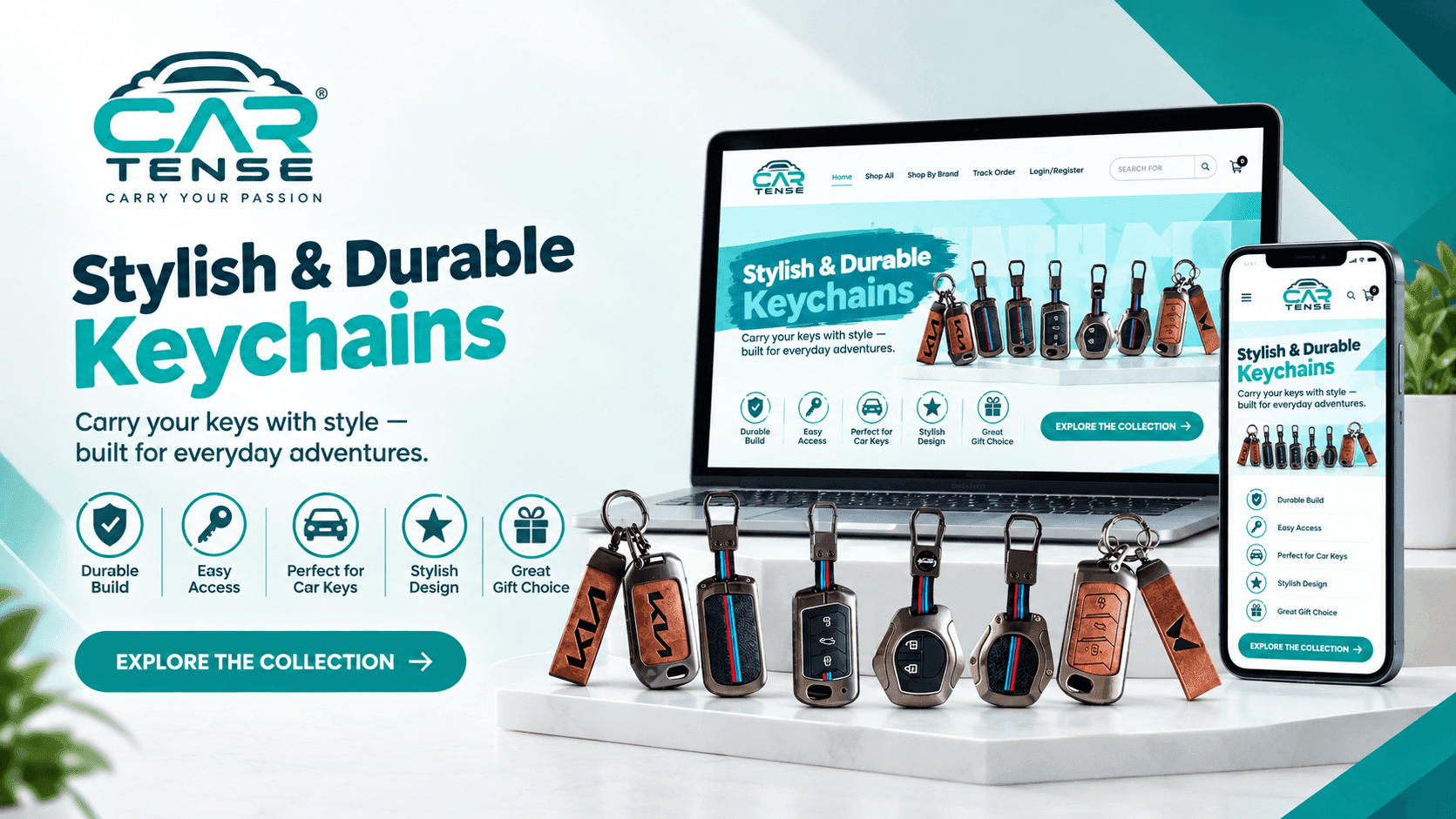
Cartense sells metal, leather and silicone covers for car keys across Indian and imported car brands. Dcrayon reviewed its Shopify store's shopping journey and simplified the path from browsing to checkout.
Cartense runs its store on Shopify. On 13 October 2026 its product feed listed 217 products: metal-leather, metal-silicone, leather, TPU and zinc alloy key covers, plus keychains and cleaning cloths, for 18 car brands from Suzuki and Hyundai to BMW and Land Rover. Each cover is made for one key shape, and product titles name it precisely, for example a two-button push-start smart key for a Toyota Fortuner, Hilux or Innova Crysta. A cover that looks right in a photo can still be the wrong size in the hand, so the route from "my car" to "the cover that fits my key" is the journey that decides whether a visit becomes an order.
Cartense asked Dcrayon to make the store easier to shop and the purchase easier to complete. The work covered the whole journey: navigation, categories, product pages, calls to action, the add-to-cart and checkout steps, and the phone layout.
Where Cartense shoppers were getting stuck
Shoppers struggled to move between product categories.
A Cartense product can be described three ways at once: by car brand, by key type and by material. A store organised along all three needs one obvious place to start and a clear path from there, or shoppers are left unsure where their key belongs. The review found that customers had difficulty moving between categories, and every wrong turn on a fitment catalogue sends the shopper back to the start.
Finding the right cover took unnecessary steps.
Product discovery needed more taps than the task deserved. For a fit-critical product, each extra step is another chance to give up or, worse, to pick a cover for the wrong key and return it.
The route from product page to checkout was longer than expected.
There were extra clicks between choosing a cover and paying for it, product information that was hard to take in at a glance, and an add-to-cart step that needed simplifying. When fit, price and offer are scattered across a page, hesitation sets in at the moment of decision.
The phone experience needed work.
Shoppers who find a key cover through a phone search or a short video arrive on a small screen, and for them the phone layout is the store. The review found the mobile experience needed improvement, from layout to touch interaction.
Where Cartense shoppers were losing their way
The problems the journey review found and why each one mattered.
| Issue | Who it affected | Business impact |
|---|---|---|
| Hard to move between categories | Shoppers browsing by brand, key type or material | Shoppers unsure where their key belongs |
| Unnecessary steps to find a cover | Shoppers who knew their car and key | More chances to leave or to pick the wrong cover |
| Long route from product page to checkout | Shoppers ready to buy | Hesitation at the moment of decision |
| Phone experience needed improvement | Shoppers arriving on a phone | Harder browsing for phone visitors |
Solution
Walking the journey from car brand to checkout
The review followed a shopper with a specific car and key from landing on the site to completing an order. It covered the homepage navigation, the category structure, product pages, the add-to-cart step, the checkout flow and responsive layouts, and looked at how the store behaved on different devices. The aim was to find friction between screens as well as on them, rather than restyle pages one at a time, and each fix below answers one of the problems the walk-through found. This is the core of our UI/UX design work.
Simplifying the menu and categories for 18 car brands
On navigation, the menu structure was simplified, categories were reorganised, and important pages became easier to reach from the header. For a store with covers for 18 brands and several key shapes per brand, a shorter, better-ordered menu means fewer dead ends on the way to the right cover.
Clearer key cover product pages
Product page layouts were cleaned up. Product presentation was improved, product details were made easier to understand, and the calls to action were given better positions on the page, so the next step is clear once the shopper has decided. On a product where the wrong size means a return, clear product details matter as much as the photographs.
Fewer clicks between a cover and the checkout
On the purchase flow, unnecessary clicks were removed and product visibility in listings was improved. The add-to-cart step was simplified, and the journey into checkout was smoothed for a shopper who has made up their mind. This is the kind of work our conversion optimisation service covers.
Phone layouts for a phone-first purchase
For phones, layouts were made responsive, touch interactions were improved, and the interface was kept consistent across screen sizes, so a shopper who starts on a phone and finishes on a laptop sees the same store. All of the changes were made within Cartense's existing Shopify setup, without changing platform.
Cartense's shopping journey before and after
What changed in each part of the journey.
| Area | Before | After | Evidence |
|---|---|---|---|
| Navigation | Customers found product categories hard to move between | Simplified menu, reorganised categories and easier access to key pages | Dcrayon project records |
| Product discovery | Finding a product took several unnecessary steps | Better product visibility in listings | Dcrayon project records |
| Product pages | Product information was hard to take in | Cleaner layouts, clearer product details and better-placed calls to action | Dcrayon project records |
| Purchase journey | Longer than expected | Fewer clicks and simpler add-to-cart and checkout steps | Dcrayon project records |
| Phone shopping | Phone experience needed improvement | Responsive layouts, better touch interactions, consistent interface | Dcrayon project records |
Results
What changed for Cartense shoppers
Shoppers now have a clearer route from choosing their car to buying a cover: a simpler menu, better-organised categories, clearer product pages, calls to action where they expect them, fewer clicks into checkout, and layouts that work on a phone. The table of changes below summarises the before and after for each part of the journey.
Commercial figures for this project are not published.
Cartense journey fixes
Each fix and its status.
| Outcome | What changed | Status |
|---|---|---|
| Clearer navigation | Simplified menu and better-organised categories | Delivered |
| Clearer product pages | Cleaner layouts, clearer details, call to action repositioned | Delivered |
| Shorter purchase path | Fewer clicks and simpler add-to-cart and checkout steps | Delivered |
| Phone-friendly layouts | Responsive layouts and better touch interactions | Delivered |
Key takeaways
What car accessory stores can learn from Cartense
For fit-critical products, navigation is part of the product: a shopper who cannot find the cover for their exact key either leaves or buys the wrong one. Brand first, then key type, then the cover is a pattern that suits any accessory sold by fitment, from key covers to phone cases and car mats.
Changes like these are easiest to judge when measurement is in place first. A short GA4 setup with funnel events lets any store compare add-to-cart and checkout rates before and after a change, and our six Shopify conversion wins list the checks we start from.
Cartense also worked with Dcrayon on SEO, YouTube Shorts and influencer marketing; see the Cartense marketing case study. If shoppers are getting lost on your store, ask us for a journey review.
CategoryWeb Development
More work