 All Case Studies




Instacertify website project at a glance
The main facts about the Instacertify website project.
| Item | Detail |
|---|---|
| Client | Instacertify Labs Private Limited, product certification and compliance, Noida |
| Audience | Product companies and their compliance teams in India and export markets |
| Our scope | Website design and build: search-first homepage, navigation, catalogue pages |
Challenge
Instacertify helps manufacturers and importers obtain product certifications, registrations and business licences in India and abroad. Dcrayon designed and built its website.
A Noida consultancy selling dozens of approvals
Instacertify Labs, based in Noida, works on approvals such as BIS registration and the ISI mark, WPC and TEC approvals for wireless and telecom products, CE marking for Europe and FCC for the United States, along with Indian business licences and registrations such as barcode registration and eating house licences. Its buyers are product companies and their compliance teams, often working across several markets at once and rarely sure at the start which scheme applies to their product.
A large compliance catalogue had to be findable by a first-time visitor
Few visitors know the full name of the certificate they need. They arrive with a product and a market in mind, and the catalogue runs to dozens of certifications, licences and registrations across India and other regions. A site that expects them to browse menus until they recognise the right scheme loses many of them before they find it.
Buyers needed an obvious first step
Compliance is a considered purchase, and a visitor who has found the right certification still needs a clear way to talk to a specialist. The site had to make that next step visible from the first screen without crowding the information buyers came to read.
Solution
A search-first homepage for certification buyers
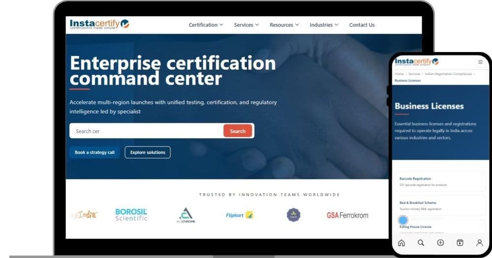
We built the homepage around a search bar under the headline "Enterprise certification command center", so a prospect can type the certification or product they have in mind and go straight to it rather than hunting through menus. Two actions sit beside the search: "Book a strategy call" with the team, and "Explore solutions" for anyone who wants to see the full list first. A band of client logos under the hero shows the kinds of companies Instacertify already works with.
Five navigation groups and card-based catalogue pages
The offering is organised under five navigation groups: Certification, Services, Resources, Industries and Contact Us. Service detail pages, such as Business Licenses, list each licence or registration as a card with a one-line description, and breadcrumb trails (the clickable path, such as Home, Services, Indian Registration Compliances, Business Licenses, shown at the top of a page) let a visitor step back up a level at any time. That structure lets someone move from a broad category to a specific licence in a few taps on a phone. This is the kind of layout work our UI and UX design team carries out.
A navy and coral design for enterprise buyers
A restrained navy and coral palette, generous spacing and the logo band give the site a calm, credible tone suited to compliance buyers, and the same layout carries across desktop and mobile. The build itself was handled by our web development team.
Instacertify page elements in the design
The building blocks of the site, from the page header to the catalogue cards.
| Component level | Examples from this build | Used on |
|---|---|---|
| Header | Logo and five navigation groups | Every page |
| Hero | Headline, search bar, strategy call and explore buttons | Homepage |
| Trust band | Row of client logos | Homepage |
| Catalogue | Breadcrumb trail and licence cards with one-line descriptions | Service pages such as Business Licenses |
Results
What Instacertify's visitors could do
Visitors could search for a certification from the first screen, see two clear next steps, and move through a deep catalogue using cards and breadcrumbs that work on small screens. The Instacertify team gained a site whose structure matched the way buyers ask about compliance: by product, by market and by scheme.
What the Instacertify website delivered
What the website gave Instacertify's visitors.
| Outcome | What changed | Status |
|---|---|---|
| Search from the first screen | Homepage search bar for certifications and products | Delivered |
| Clear next steps | Strategy call and explore actions beside the search | Delivered |
| Navigable catalogue on phones | Card listings with breadcrumb trails on service pages | Delivered |
Key takeaways
Search and structure for a technical catalogue
When a catalogue is large and the names are technical, search and clear structure do more for a visitor than a long homepage. A breadcrumb trail is a small feature, but on a phone it is what keeps a visitor oriented three levels deep. If your site sells a complex service, our website redesign service starts from how your buyers phrase their first question, and our article on UI and UX web design explains how we plan navigation for sites like this.
To discuss a website for your consultancy, get in touch.
CategoryWeb Development
More work